Daniel’s Music Foundation / Accessible Design Overhaul
When Accessibility Moves From Checklist to Creative Brief.
Daniel's Music Foundation has been empowering people with disabilities through music for over two decades in New York City. When they expanded to remote programming during Covid-19, their potential audience went from local to global — but their website couldn't keep up. They needed a full rebuild that could serve two very different audiences: students with a wide range of disabilities, and high-net-worth donors and partners of all abilities. The brief came down to three words: Joy, Impact, and Accessibility.
The work spanned branding, creative direction, UX, design, and copywriting — every layer built around a single conviction: accessibility is a creative opportunity, not a constraint. Instead of treating compliance as a checklist referenced near the end of the project, the team put it at the center from day one. The brand was adapted for digital expression with an extensive color palette developed and tested specifically for contrast and range, giving the site variety across high-volume content like event cards without ever sacrificing legibility. The UX favored larger-scale UI elements to better serve users with visual and mobility impairments, with explicit copy baked into interactive elements — "Close" buttons that say close, "Flip card" CTAs that tell you exactly what happens next. Copywriting went beyond headlines and body text: alt text was treated as core copy, and language choices were made with intention — "Play video" instead of "Watch video" to normalize all ways of experiencing content. Even the motion design was considered, with subtle hover states that added liveliness without triggering repetitive behaviors that could hinder the experience for some community members. One standout detail: Daily Smiles, a smiley-face animation that rolls onto the screen, shares an inclusion quote from DMF Co-Founder Daniel Trush's original music, and rolls away — a moment of joy designed to land without getting stuck.
Nothing could be inaccessible. And nothing could be less than great design.
Impact: Webby Awards People's Voice Winner, 2024 — Accessible Technology (Websites and Mobile Sites). Anthem Awards Silver, 2024 — Diversity, Equity & Inclusion. The redesign immediately elevated brand perception among potential donors, drove a record high in inquiries, and generated exponential interest from instructors who wanted to work with DMF. BASIC/DEPT® earned Webby Agency of the Year in part on the strength of this project.
Role: Creative Direction, Branding Development, Design Direction
We adapted DMF’s brand for online expression and translated the heart of their in-person experience into a digital home.
Alive with color – and contrast.
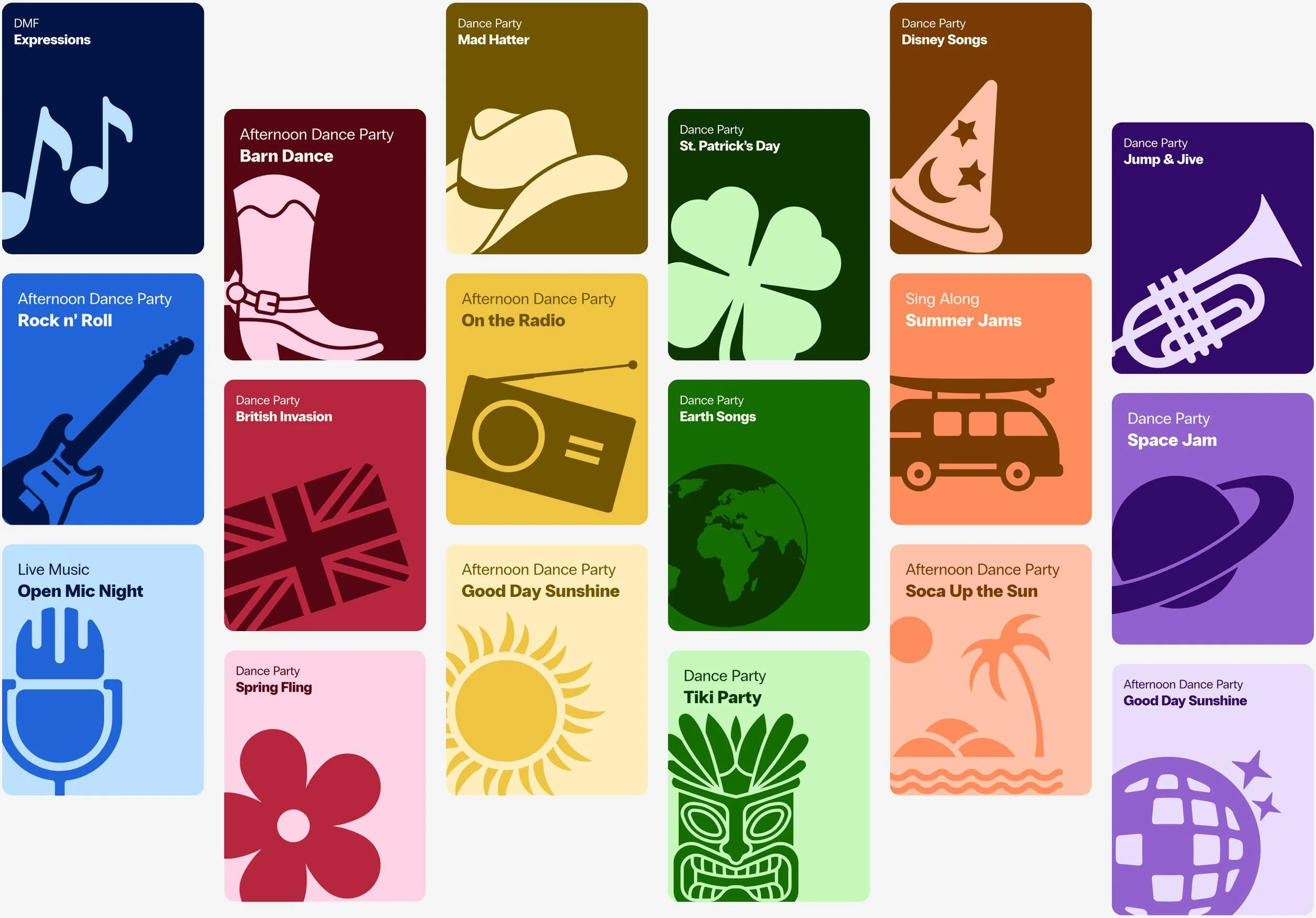
We developed and tested an extensive color pallet at the beginning of the project that would give us a wide range of color combinations to work with. It came in handy to create variety across high volume content like these event overview cards for DMF’s packed calendar.
Clarity and connection through voice and tone.
We helped DMF nurture a sense of belonging by crafting a warm, conversational voice with clear language. We treated alt text (text that screen readers read aloud to describe images) as a core part of our copy and thoughtfully chose our CTA language – like using “Play video” instead of “Watch video” to normalize all ways of enjoying an experience.
All of the experience touch points were designed to be inclusive and encourage discovery.
From the beginning, our design system accounted for accessibility in every UI element. We favored a larger scale to better serve users with visual and mobility impairments, included copy for UI elements like “Close” buttons to make actions more explicit, and leveraged subtle motion for special details like hover states to add liveliness without hindering interactions.
Showcasing impact with interactions.
We designed colorful, flippable cards with stats about the powerful results of DMF’s programs, leveraging our UI system to make the action explicitly clear. Each card includes a “Flip card” CTA to communicate how to reveal not only more in-depth descriptions of each statistic, but also DMF’s ambitious goals for the upcoming year.
Letting DMF’s thoughts shine, one tidbit at a time.
We embraced carousels to share robust information like community testimonials and DMF’s big-picture dreams. And to ensure they were screen reader accessible, we set clear expectations for the amount of content by indicating the number of slides in our UI. We also designed the cards to bleed off the screen to emphasize there was more to explore.
We even found some ways to include surprise moments of fun with Daily Smiles.
Inspired by the joy that DMF strives to bring to their community every day, we created Daily Smiles: a smiley-face animation that rolls onto the screen, reveals a quote about inclusion from an original song by DMF’s Co-Founder Daniel Trush, and then rolls away – giving people a moment to smile without getting stuck by the repetitive behaviors that we learned can hinder the experience of some of DMF’s community members.
Role: Creative Direction
Created in partnership with BASIC®